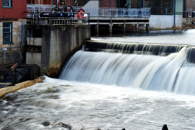
Recently, I did a mixed-media project in Photoshop CS6 & CC. I used a photo from the Wachussett Reservoir Dam, a picture of Ho-Oh, Drawings of music notes and a Poké Ball, a painting I made, and a gradient overlap.
The strongest part of this project is the background. The background is probably the most complex part of this project. I used a painting, a gradient, and a lot of Poké Balls.
I could improve on the frames. The reason why I think I should improve on this area is that the drop shadow was not used on one of the frames. I could also improve on image placement & follow the rule of thirds better.
The easiest part of this project was probably laying out all of the mediums/layers. The reason why making out the layout was easy is that I could experiment with different mediums, filters, & adjustments. The layout also is a way to make my ideas a reality.
The difficult part of this project was probably choosing the photo. It was difficult because I had many photos, and only a few could make the cut. One of the requirements was to have a person in the photo, which is a really rare sight in my photos due to being a nature photographer.
I used my illustrator music notes & Poké Balls in the foreground. I used my photo & Polaroid frames in the mid-ground. I used my painting with a gradient overlay in overlay blending mode with Poké Balls of all different sizes & blending modes for the background. I used my autograph & an inspirational aphorism as typography. I used 6 cutouts & frames.
If I could do this project again, I'd take more advantage of my filters & adjustments, and make better drop shadows.


