
Monday, May 22, 2017
Classmate Critique
The Visual I’m critiquing is Olivia’s Cartoon. It is a self-portrait. There are vibrant colors. This artwork uses more than one medium. She drew the outlines on paper, scanned it, and used image trace in Illustrator. She added the colors in Photoshop.
There are many flaws in the image. First, it is in the center, which does not follow the rule of third. Secondly, the table is in a top-down perspective, when the image is a front perspective, which also means that the table has no 3d-esque relief. Finally, there’s no arms.
There are many strengths in the image as well. First, there’s detail. Second, there’s artificial lighting in it. Finally, the colors are realistic.
The reason why these are the strengths is that the details bring relief to the cartoon, the lighting effects bring environmental effects, and the colors bring life to the cartoon.
Olivia used many tools in Photoshop. She used the brush to add color. She used color swatches to find the right colors. She also used dodge & burn to add the artificial lighting effects.
In conclusion, Olivia did a good job on the cartoon, here’s some suggestions on how she could improve it. She should add more details, such as arms, realistic shoes, a 3d-esque table, and a chair.
Tuesday, March 28, 2017
My Cartoon Self-Portrait
Recently, I did a vector cartoon in Illustrator CC 2017.

The strongest part of my project is color and relief. I used colors to match the shades of light. I used flat vectors to express my cartoon in an artistic way.
I could improve on the glasses. I could have used the pen tool instead of the blob brush tool. The glasses could be more precise.
I used the pen tool, blob brush, and gradient tool. I used the pen tool to create flat vectors, I used the blob brush tool to create the glasses, and I used the gradient tool for the background.
The only difficult part was when I started it, I did not know where to start. I demonstrated the objectives by making this cartoon out of flat vectors.
If I could do this again, I would make a detailed background.
Friday, March 3, 2017

Wednesday, March 1, 2017
Pokémon Mixed-Media Masterpiece
Recently, I did a mixed-media project in Photoshop CS6 & CC. I used a photo from the Wachussett Reservoir Dam, a picture of Ho-Oh, Drawings of music notes and a Poké Ball, a painting I made, and a gradient overlap.
The strongest part of this project is the background. The background is probably the most complex part of this project. I used a painting, a gradient, and a lot of Poké Balls.
 I could improve on the frames. The reason why I think I should improve on this area is that the drop shadow was not used on one of the frames. I could also improve on image placement & follow the rule of thirds better.
The easiest part of this project was probably laying out all of the mediums/layers. The reason why making out the layout was easy is that I could experiment with different mediums, filters, & adjustments. The layout also is a way to make my ideas a reality.
The difficult part of this project was probably choosing the photo. It was difficult because I had many photos, and only a few could make the cut. One of the requirements was to have a person in the photo, which is a really rare sight in my photos due to being a nature photographer.
I used my illustrator music notes & Poké Balls in the foreground. I used my photo & Polaroid frames in the mid-ground. I used my painting with a gradient overlay in overlay blending mode with Poké Balls of all different sizes & blending modes for the background. I used my autograph & an inspirational aphorism as typography. I used 6 cutouts & frames.
If I could do this project again, I'd take more advantage of my filters & adjustments, and make better drop shadows.
The strongest part of this project is the background. The background is probably the most complex part of this project. I used a painting, a gradient, and a lot of Poké Balls.

The easiest part of this project was probably laying out all of the mediums/layers. The reason why making out the layout was easy is that I could experiment with different mediums, filters, & adjustments. The layout also is a way to make my ideas a reality.
The difficult part of this project was probably choosing the photo. It was difficult because I had many photos, and only a few could make the cut. One of the requirements was to have a person in the photo, which is a really rare sight in my photos due to being a nature photographer.
I used my illustrator music notes & Poké Balls in the foreground. I used my photo & Polaroid frames in the mid-ground. I used my painting with a gradient overlay in overlay blending mode with Poké Balls of all different sizes & blending modes for the background. I used my autograph & an inspirational aphorism as typography. I used 6 cutouts & frames.
If I could do this project again, I'd take more advantage of my filters & adjustments, and make better drop shadows.
Whitnsfalls USA
On Sunday, I went to Whitinsville, Mass to see 4 waterfalls. I took this magnificent photo at the Whitin Mill.
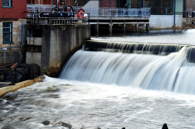
The strongest part of this photo is the composition & the depth of field. The reason is that I took this photo from an angle, I made it so the mill was on the edge.
I think I could improve on the bottom edge & camera/tripod placement. I think it needs this improvement because the fence appeared on the bottom.
I used a Digital Single Lens Reflex Camera on a tripod with an IR remote to take this photo. The mode I used was S mode so I could get the blurred effect on the running water.
I put my camera on a tripod so the photo could be legible. I used the remote to reduce shaking. I used S mode for the effect.
The easy part was probably everything. The reason being that I do my best when taking photos.
Monday, January 30, 2017
Introducing the photographer with personality!
Hello, My name is Joseph Laforest. I am a photographer that specializes in nature and special occasions. Since this is my first post, here's one of my best photos.
I hope everyone enjoys this blog.
~Joseph Laforest

I hope everyone enjoys this blog.
~Joseph Laforest

Subscribe to:
Posts (Atom)